  |
|
|
|
|
|
|
|
|
|
|
|
| BELLADONNA |
|
| is my second novel, published in the US and UK in 1998.
I'd been wanting to write a novel for a long time - particularly a Baroque sort of twisted saga a la Count of Monte Cristo - but hadn't yet found its core of inspiration. And then one balmy summer weekend, I went to a formal dinner party at one of the most famous stately homes (okay, so it was more like a castle, and the reason I'm not naming it will soon become clear) in England. My beau at the time couldn't make it at the last minute, so I (dumb Yank that I was) went unescorted. I thought going to such a party would be a huge adventure.
That was Mistake #1. Mistake #2 was accepting the Lord of the Manor's invitation for a tour (Dumb Yank thought it would be fun as there were 500 people in the house, as well as The Wife and too many servants to count). He took one look at the Unescorted Yank and Mistake #3 was going up the servants' staircase off the kitchen to the part of the stately home where tourists did not venture. Being a New Yorker with a big mouth and bigger ability to kick swiftly where it hurts prevented Mistake #4 from happening, and as aforementioned Lord of the Manor took me back downstairs to the kitchen, unabashed I might add, there stood his wife. With the most terrible look on her face. And I suddenly realized, he did this all the time.
So I decided over many more years that I wanted to write about that feeling of being up in that dark hallway, with a stranger - a man of power and means in his circle of like-minded aristocrats - who wanted to have his way with me, simply because he thought he could. I wanted to write about that peculiar feeling of dislocation, that if that Lord of the Manor had locked me in a room, no one would ever have found me.
Eventually, all that darkness was spun into BELLADONNA. But I needed to write LUNCH first, as I didn't yet have the technical skill to pull of such a complicated plot.
Some of the reviews:
"This ripping period romp is sure to make a splash...Moline writes like Jane Austen on steroids."
"Moline's characters are Jacobean in their ferocity...whose antics would bring a blush to the cheek of the Marquis de Sade."
"Harold Robbins meets The Story of O...and it's selling like ice cream in July."
"One sexy beach read."
"A Count of Monte Cristo meets Anne Rice opus."
"Karen Moline has got us where she wants us."
"A page-turner...vivid...seductive."
"A fascinating lead protagonist...erotic, exotic places...BELLADONNA is the book to take you there."
|
|
|
|
|
|
Covers for BELLADONNA |
|
|
|
|
 |
|
 |
|
 |
|
 |
|
|
|
|
|
|
|
|
|
|
|
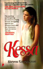
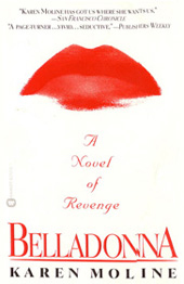
US HARDCOVER
I just loved this cover. The designer (Jackie M. Meyer), illustrator (John Martinez), and the guy who hand-lettered BELLADONNA (Carl Dellacroce) got the mood and deliberate melodrama of the book, complete with Belladonna's beloved red gloves. I thought it was old-fashioned yet still contemporary, if that makes any sense. |
|
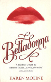
US PAPERBACK
This cover worked in an equally confrontational way but feels completely different. The lips were deliberately smeared, as Belladonna's life had been. It looked great when this was made into long ads to fit into the NYC subway cars, and I got a lot of excited calls from my friends telling me they saw it next to Dr. Zizmor the Zit Doctor's ads. |
|
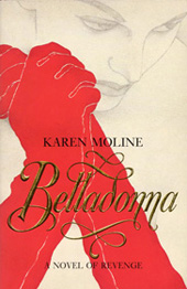
UK TRADE PAPERBACK
The image on UK trade paperback was the same as the US, but they didn't use the silver-foil paper, so the background was a dull grey and it didn't quite pop in the same way. Oh well! |
|
UK PAPERBACK
This combined the Baroque lettering of the US hardcover with the smeared lips of the US paperback. I think the US version works better. |
|
|
|
|
|
|
|
|
|
|
|
 |
|
 |
|
 |
|
|
|
|
|
|
|
|
|
|
|
|
|
JAPAN
No one designs graphic elements better than the Japanese, and this is no exception. |
|
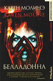
RUSSIA
I like the image - they got the gloves right! |
|
SWEDEN
Deliberately blurry, with nice little skulls on the necklace - a clever touch. |
|
|
|
|
|
|
|
|
|
|
|
|
|
| LUNCH |
|
| was my debut novel, first published in the US and UK in 1994. And I am thrilled to announce that it has just been reissued as a digital download in the UK only. [Click here to order.] (Leave a review while you're at it – thanks!)
I first got the idea for LUNCH when I was having - what else? - lunch with a girlfriend at Joe Allen's restaurant in London. As she and I were engrossed in conversation, I became aware that someone was staring at me. Not just staring - literally devouring me with his eyes. It was actually kind of creepy until my girlfriend told me the man was a friend of hers, a fellow actor, and she invited him over for a coffee. He turned out to be a nice guy who'd been a professional boxer, so he had a very specific physicality in an extremely coiled package.
Anyway, I'd been thinking of writing a novel for a while, as I was working flat-out as an entertainment journalist and was busy profiling the rich and infamous. Lots of people didn't believe me when I told them that many of these celebrities may have had undeniable acting or singing talent but otherwise not much else to say (I'm being kind LOL). But one thing those at the Very Top did have in common was that they got what they wanted, when they wanted it. I'd gotten so fed up with dealing with the rampant egomania of the stars and their handlers that if I hadn't found a productive outlet to manage the aggravation I would have gone bonkers.
So I took the feeling of being creeped out by the gaze of a stranger and combined it with wanting to write about what happens to a superstar when no one ever says no to you (coupled with a latent taste for sadistic behavior, sexual and otherwise).
That LUNCH sold quickly in many different countries showed I'd definitely hit a nerve - and what's more universal than sex and Hollywood?
Some of the reviews:
"If The Bridges of Madison County had a dark, erotic side, this book would be it. A stunning debut!"
"Intense...erotic...compelling...genuine electricity...the characters are magnetic."
"Erotically charged. LUNCH will put you in the mood. A titillating, tasty morsel. Bon appetit!"
|
|
|
|
|
|
Covers for LUNCH |
|
|
|
|
|
|
 |
|
 |
|
 |
|
|
|
|
|
|
|
|
|
|
|
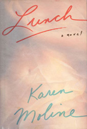
US HARDCOVER
This US hardcover design was a terrible disappointment. I'd actually gone to a bookstore with the designer, and had told her what I didn't want: pastel, soft, indistinct, etc - because the novel is blunt, X-rated, and, well, in your face. What she ended up doing was precisely the opposite. Not only does it completely miss the feel of the book, but it didn't scan properly when used in newspaper reviews, as the overlay is semi-transparent. Instead, it read as black. And there was nothing I could do about it. |
|
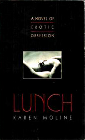
US PAPERBACK
Avon redeemed themselves with this cover, which is not only sensationally dramatic, but perfectly captures the content of the book. One glance and you know what it's about. That the hardcover publisher couldn't have bothered to do something like this was devastating. |
|
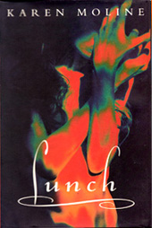
UK HARDCOVER/ PAPERBACK
This cover was incredibly dynamic and I was extremely happy with it, especially as it came out before the dreadful sanitized pastel US rip-off cover. At first glance it's hard to decipher as the photograph was deliberately distorted, but then the woman's figure becomes clear - sort of what happened to Olivia in the novel itself. It also looked great on bookstore shelves unlike the heinous US cover. I was glad they used this image for the hardcover, trade paperback, and paperback editions. |
|
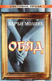
BULGARIA
A lovely naked butt. |
|
|
|
|
|
|
|
|
|
|
|
 |
|
 |
|
 |
|
 |
|
|
|
|
|
|
|
|
|
|
|
CZECHOSLOVAKIA
I love my new last name! |
|
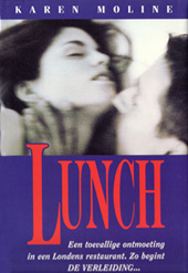
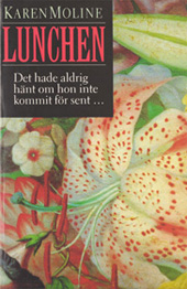
DENMARK
At first I went, Huh? But then the painting grew on me. The colors work. |
|
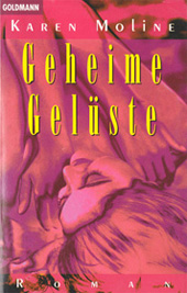
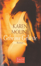
GERMANY #1
Two covers: One lurid pink (which I think is hilarious) for bookstores and one a lower priced edition, complete with a thong that looks mighty uncomfortable. That poor model has all my sympathy. |
|
GERMANY #2 |
|
|
|
|
|
|
|
|
|
|
|
 |
|
 |
|
 |
|
 |
|
|
|
|
|
|
|
|
|
|
|
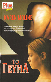
GREECE
When I first saw this, I thought the man's torso at the top was a roasted turkey leg. I still can't figure it out! |
|
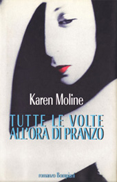
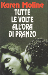
ITALY #1
The cover using the stunning Bill Brandt photo is indescribably beautiful, and now a rare collector's item. Unfortunately for me, Bompiani, the Italian publisher, hadn't gotten the proper permission to use this image pre-publication, and the Brandt estate made their displeasure known (as was well within their rights). |
|
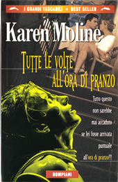
ITALY #2
As a result, the books had to be yanked off the shelves and the covers destroyed. That was a heartbreaker, particularly as the replacement cover isn't quite as gorgeously sophisticated (okay, so it's a little cheesy, but the models sure have great hair)... |
|
ITALY #3
... and the paperback edition features a sweaty lady with some sort of metal coil around her neck (did they find it lying around the set of Alien?). |
|
|
|
|
|
|
|
|
|
|
|
 |
|
 |
|
 |
|
 |
|
|
|
|
|
|
|
|
|
|
|
HOLLAND
Of all the book covers, this one most closely follows the storyline of the book, and is both sexual and violent. I only wish the image had been bigger as that would have made an even more potent statement (sorry, bad pun, couldn't help myself!). |
|
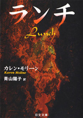
JAPAN
Have zilch idea what this is - but it's as aesthetically gorgeous as the Japanese version of Belladonna, so I'm not complaining. |
|
PORTUGAL / BRAZIL
This eye-grabber would never work in Wal-Mart LOL. |
|
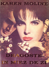
ROMANIA
The woman doesn't look at all like Olivia, the heroine, but I guess the guy lurking over her shoulder can pass for a debauched Hollywood superstar. |
|
|
|
|
|
|
|
|
|
|
|
 |
|
 |
|
|
|
|
|
|
|
|
|
|
|
|
|
|
|
SWEDEN
Clever use of sexually suggestive flowers. |
|
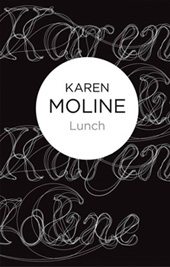
UK DIGITAL DOWNLOAD
This is the Bello formatted cover, and it fits the theme of the book perfectly. |
|
|
|
|
|
|
|
|
|
|
|
|
|
Early Fiction – Before I was capable of writing my own novels, I got two jobs that were more like extensions of all the line editing I'd been doing. |
|
|
|
|
|
|
|
|
|
|
|
|
|
|
|
|
|